Power BI Feature Request: Larger Icons for Selecting Chart Types

Power BI Visuals are awesome!
I love all the basic ones, they should be the staple of any Power BI Dashboard
Line Chart
Bar/Column Chart
Text Based: Table, Matrix, Card, Multi-Row Card
Then of course, there all these other cool ones 😎: Treemap, Ribbon Chart, Gauge and lots more. (Just be careful you know when and how to use them correctly. Don’t use them just for the coolness factor).
Finally you have lot more options for Custom Visuals, by clicking “Get More Visuals”.

We love Excel, don’t we! yup, we do.
And we love that Excel + Power BI = Great Together! And that is not a co-incidence. Excel and Power BI teams have a long history of collaboration.
And this may be one place, where Power BI can borrow some tried-and-tested goodness from Excel.
The Chart Selector Icons in Excel Ribbon are Much Larger and Easier to Use.
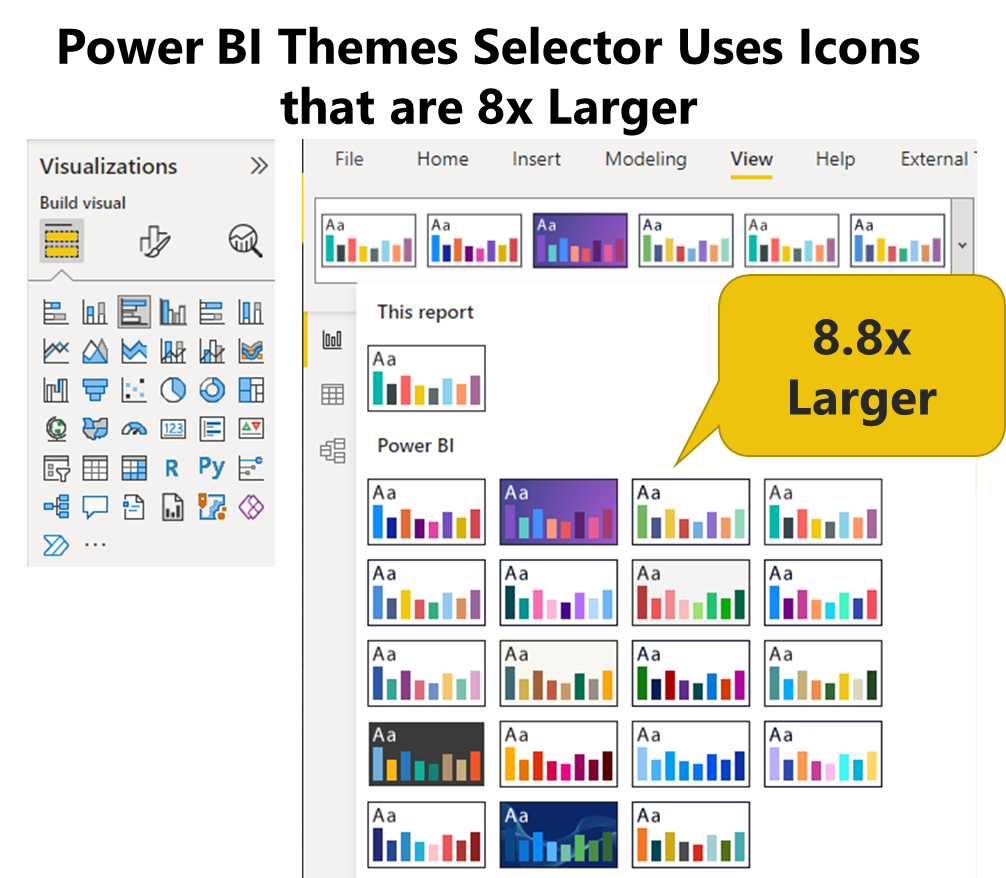
In fact, I feel there is one place where Power BI has already borrowed from the Office/Excel Ribbon interface. The gorgeous “Themes Selector”. With large, easy to see and use icons.
Vote for Idea: Large Chart Type Icons in Power BI
May be you have had the same struggle as me.
Or may be, after reading all this, you just want to help a guy out :-)
Either way, I would really appreciate if you clicked the link below and cast a vote for this idea: