🏪 Turning Store Energy Data into Better Decisions with Power BI by Antony Cannell
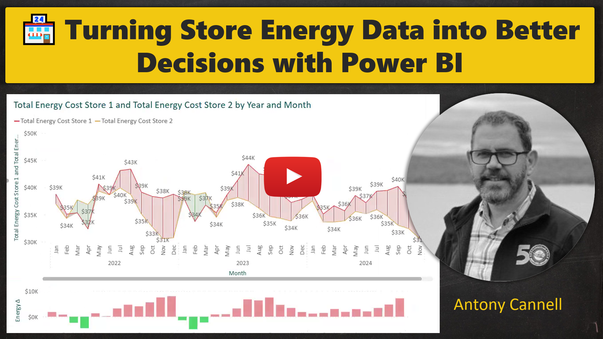
Antony Cannell, Director of Engineering & Real Estate at a large retail organization, has been one of my Private Power BI Coaching clients for a while now. As I said during this session, I have probably learned as much from Antony as he has from me.
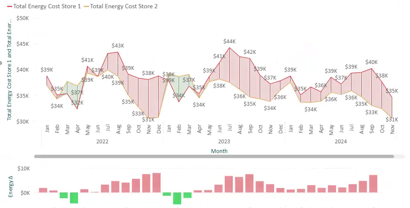
In this presentation, Antony shares a creative technique for comparing two metrics over time and making the difference between them instantly clear.
He demonstrates the technique using store energy data, but the real lesson goes far beyond energy reporting. It is a practical approach that could be valuable anywhere business users need to understand performance, variance, and change over time.
Here’s what you can expect from Antony’s presentation:
Comparing Two Metrics Over Time: Antony shows how to plot two measures together so the difference between them is easy to follow.
Using Standard Power BI Visuals Creatively: He combines a standard line chart with error bars to connect the two measures and highlight the gap.
Making Variance Instantly Visible: Red and green shading makes it clear where one metric is performing above or below the other.
Applying the Technique to Finance and Other Business Scenarios: The same approach could be used to compare:
Actuals vs. budget
Actuals vs. forecast
This year vs. last year
Business unit vs. company average
Sales vs. target
Any two metrics where the variance over time matters
This session shows how Power BI can go beyond reporting numbers and become a powerful storytelling tool — helping business users quickly see what changed, where performance improved, and where attention is needed.
Scroll up 👆 to watch the Full Video ▶️ by Antony Cannell
